
Dawg Pound
Problem
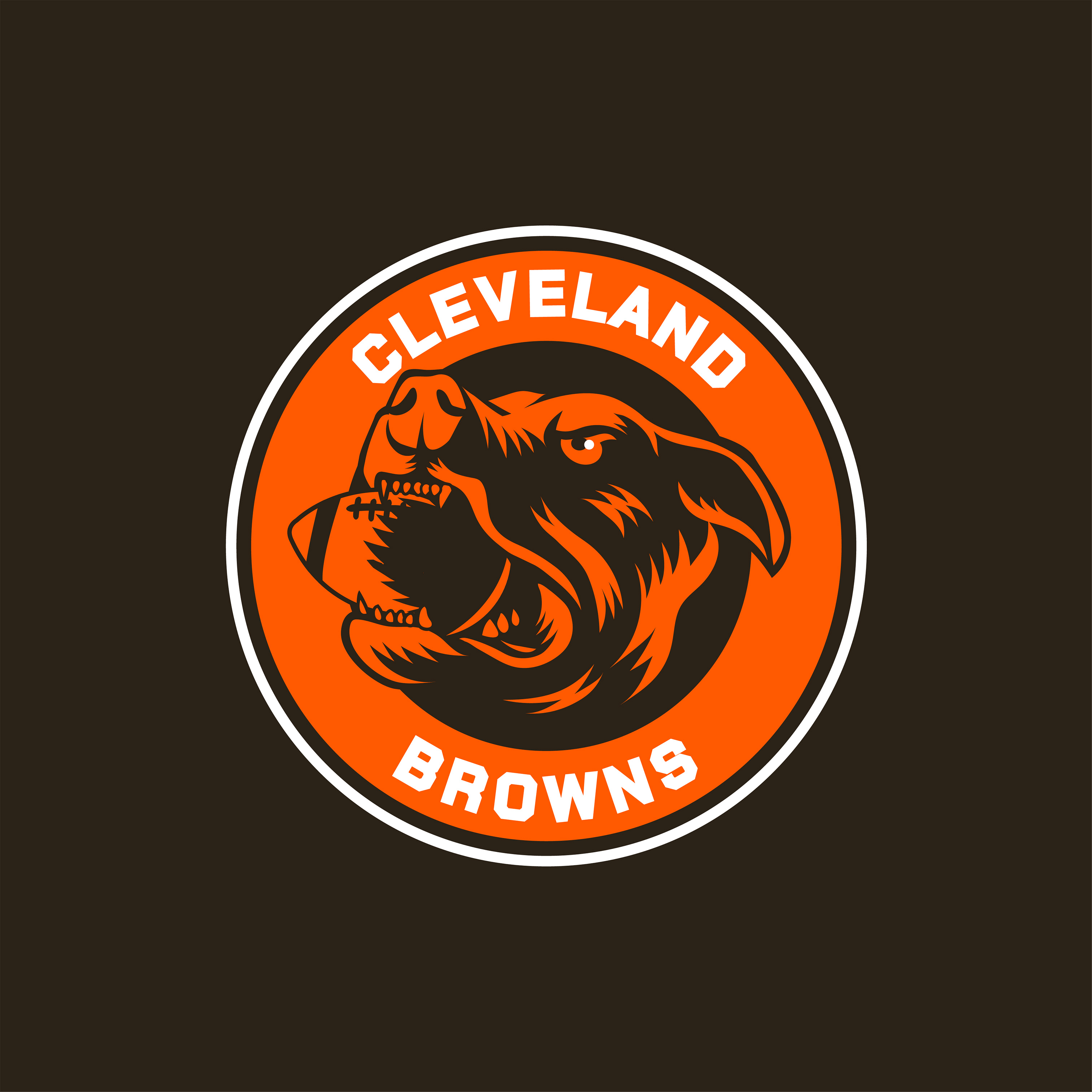
The Cleveland Browns have one of the most passionate fan cultures in the NFL, yet the Dawg Pound has never had a visual identity of its own. Decades of organic lore, rituals, and energy existed with no cohesive brand system to represent them.
- Establish a standalone visual identity for the Dawg Pound
- Preserve Cleveland's blue-collar spirit while modernizing the mark
- Build a flexible logo and typography system that works across applications
- Create a foundation that could extend into merchandise, signage, and fan experience
Approach
I treated this as a full identity system rather than a logo exercise. The primary mark pairs an aggressive dog head with a football, drawn to feel raw and heavy and distinctly tied to Cleveland. Typography is built on Chakra Petch, a bold technical face that reinforces the mark's intensity, alongside a focused palette of signature orange and near-black.
- Logo design and brand mark development
- Typography and color system definition
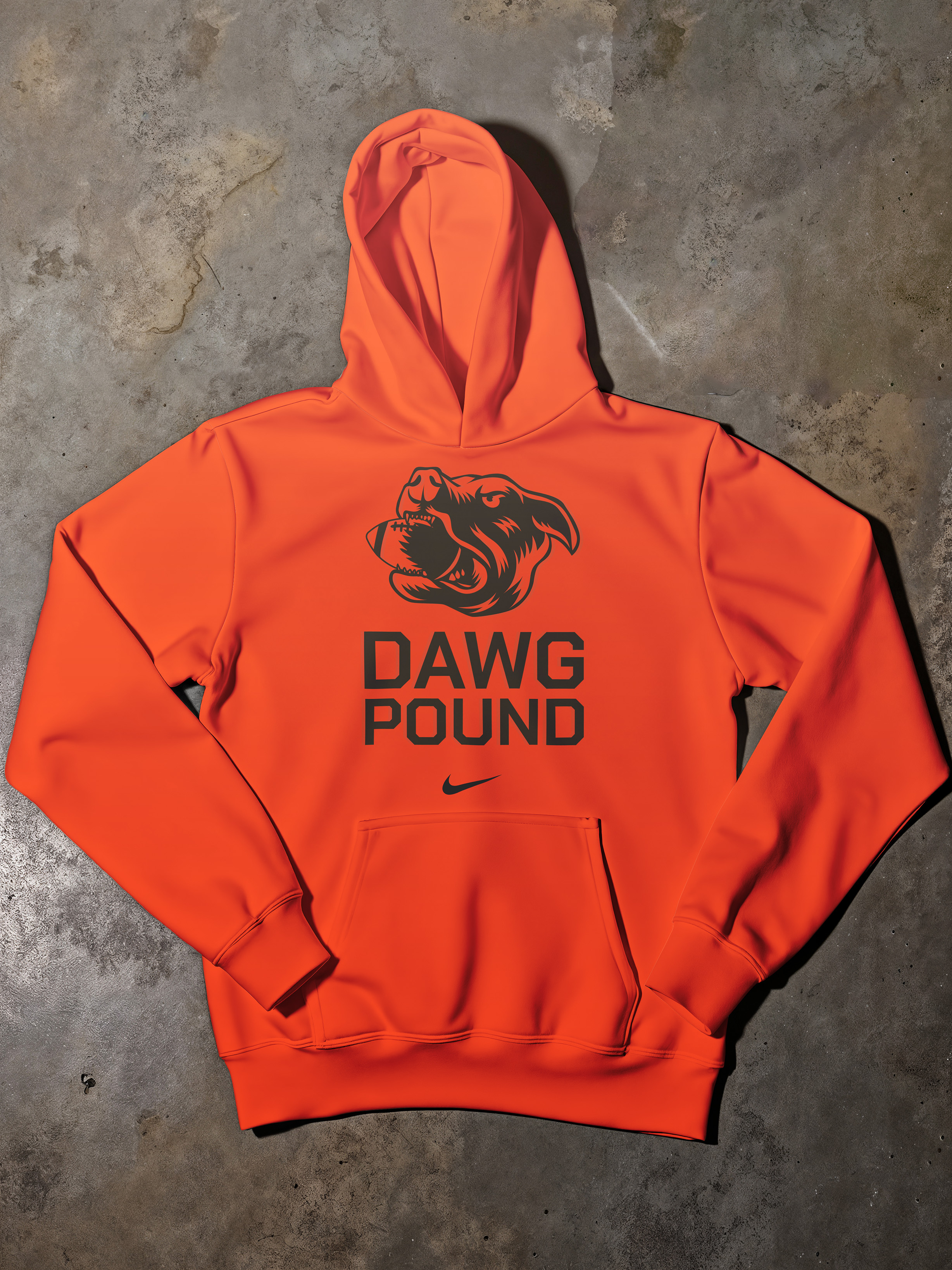
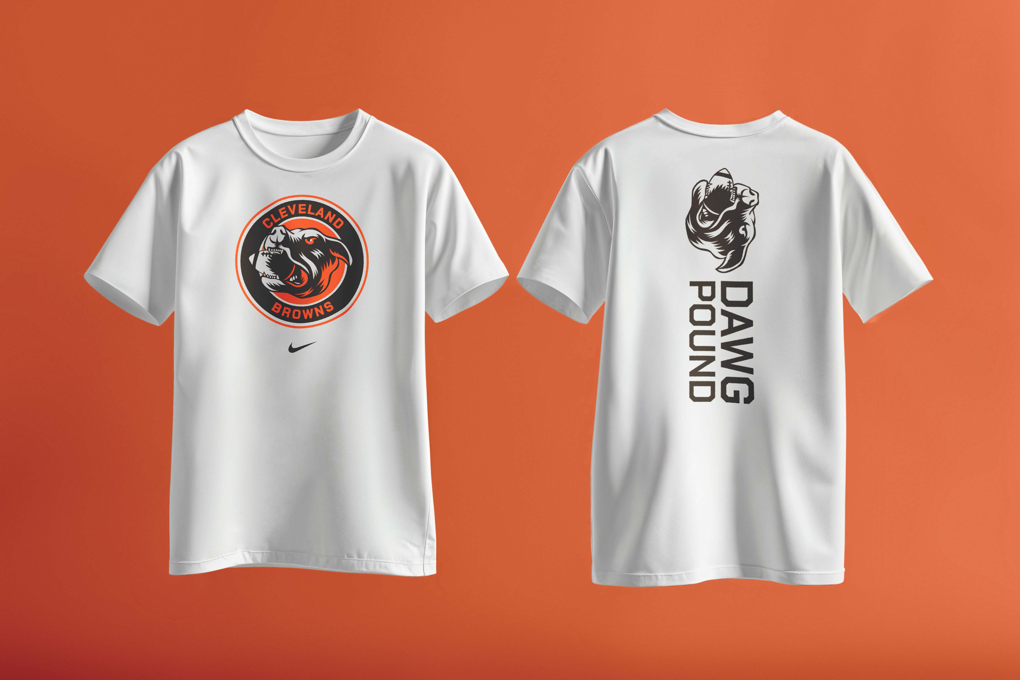
- Merchandise and apparel application design
- Brand extension across signage, streetwear, and fan experience concepts
Outcome
A complete conceptual brand system built to feel earned rather than manufactured — flexible enough to live across jerseys, streetwear, stadium signage, and digital platforms while staying rooted in the loyalty that defines Cleveland's fan base.
- A distinctive, ownable brand mark for the Dawg Pound
- A scalable identity system across merchandise and stadium applications
- A framework for turning fan culture into an official brand story
Not affiliated with or commissioned by the Cleveland Browns or the NFL. Created as an independent brand systems exercise.
