TillesCenter
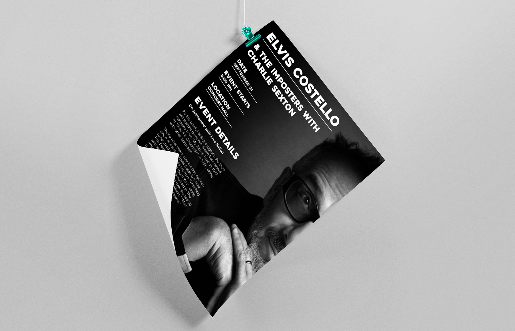
Designed multi-channel promotional advertisements for nationally recognized artists, aligning artist identity with Tilles Center’s brand system. Each campaign balanced strong visual impact with structured information hierarchy to drive clarity and engagement.
Scroll to explore

Service
lead marketing campaign
Date
2024
Purpose
TillesCenter
Problem
Create scalable promotional assets that maintain venue brand consistency while adapting to distinct artist identities. The challenge was communicating essential event data clearly without compromising visual presence.
- Preserve brand system integrity
- Prioritize readability across formats
- Adapt design tone per performer
Strategy
Built each composition around a clear typographic hierarchy and grid-based layout to optimize information flow. Leveraged image dominance, contrast, and modular spacing to ensure adaptability across print and digital placements.
- Grid-driven layout system
- Strong focal imagery
- Structured data presentation
- Format-flexible design

Outcome
Delivered cohesive, high-impact advertisements that reinforce venue branding while elevating artist presence. The final assets demonstrate strategic design thinking, system alignment, and production-ready execution.
- Clear visual hierarchy
- Brand-consistent execution
- Cross-platform adaptability